William Blair
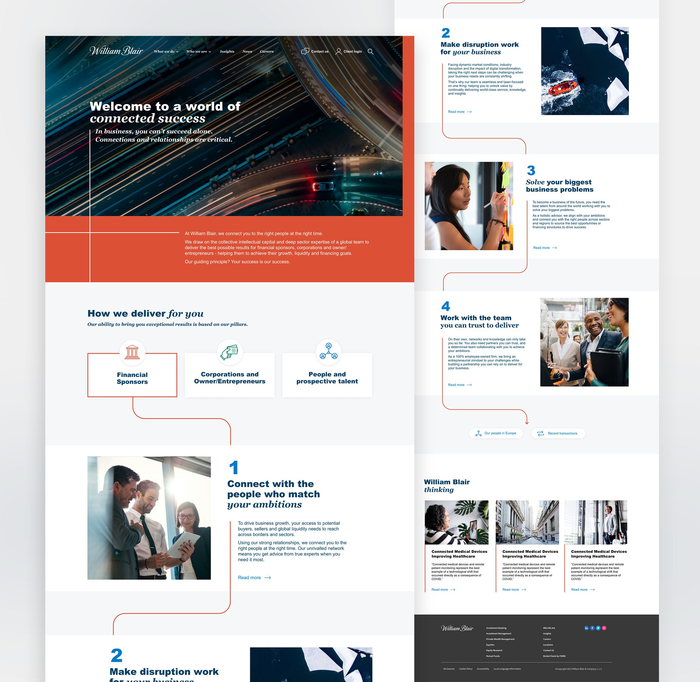
Below are some landing page options for William Blair I designed whilst working at Edelman. Incorporating their branding with the angled lines, these continue throughout the page to create a thread for the user to follow. The first section is split into three main audiences. Users can easily click on the relevant tab to access specific content for them. The section following on from this shows services and information relevant to that sector. Highlights from the blog provide visitors with valuable insights and information.
For option 2 bold orange is used in the main banner. For balance this colour is used in a more subtle way following this in the panels. The second option uses icons to separate the first sector tabs. The flow following this is numbered creating a clearer journey for the user.


