Dove infographic
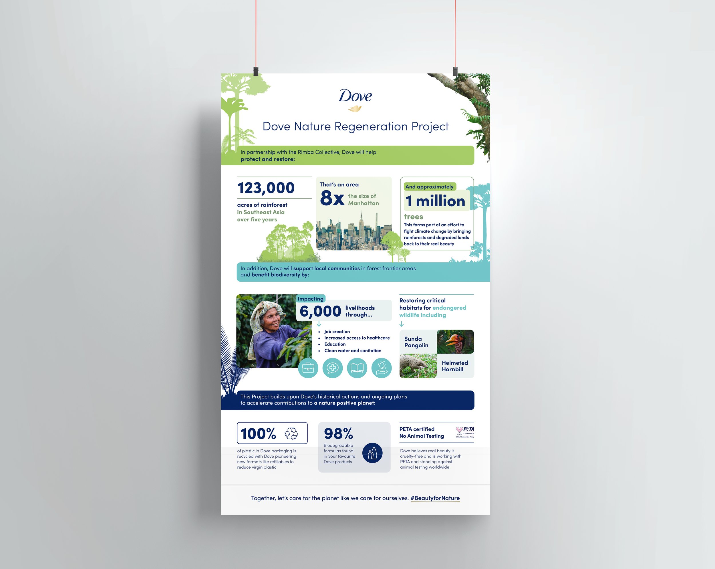
Below are some options for an infographic I worked on for Dove. The infographic is about a new regeneration project and the positive impact on the environment and community in North Sumatra. Each infographic has the same content just structured in a different way. Colour, varying font sizes and graphic elements are used to create a clear visual flow and highlight important information.
Infographics
Typography

The options below were the initial starting points for the design. After working on these the client decided to go with a vertical poster as shown in the above examples. On the left hand side typography and photography is used to emphasise each statistic. On the right photography, typography and iconography work together to create more of a hierarchy. The colours separate the sections and the line helps the reader to follow the order of content.

